QR Code Best Practices: Ensuring Scannability and Print Quality
You’ve devised the perfect marketing campaign, built a beautiful landing page, and generated your QR code. You print thousands of flyers, only to realize... the code doesn't scan.
This is a nightmare scenario for any marketer or business owner. While QR codes are incredibly resilient technology, they are not invincible. To ensure your users have a seamless experience, you need to follow specific design and printing guidelines. This guide covers the essential best practices to guarantee your QR codes work every single time.
1. Contrast is King
The most common reason for a failed scan is poor contrast.
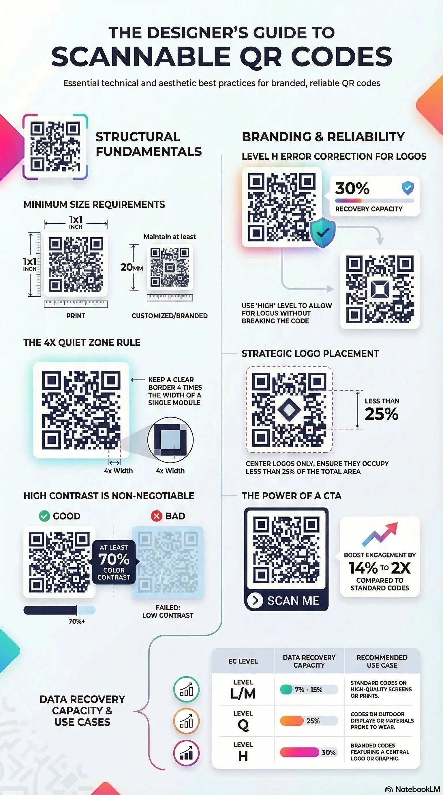
- The Rule: Always use a dark foreground (the code pattern) on a light background.
- Why: Scanners detect the contrast between the light and dark modules. Standard black on white is the most reliable combination.
- What to Avoid: Light yellow codes on white backgrounds, or dark codes on dark blue backgrounds. Also, avoid "inverted" codes (white pattern on black background) unless you have tested them thoroughly, as some older scanners struggle with this.
2. Size Matters
A QR code that is too small cannot be read by a standard smartphone camera.
- Minimum Size: Generally, a QR code should be at least 2cm x 2cm (0.8 inches) for print.
- Distance Factor: The scanning distance matters. A good rule of thumb is a 10:1 ratio. If you expect the user to be 10 inches away, the code should be 1 inch wide. If they are 10 feet away (like a billboard), the code needs to be 1 foot wide.
3. Don't Overcrowd the Design
While it's tempting to add your logo to the center of the QR code, customization must be done carefully.
- Error Correction: QR codes have built-in "error correction" which allows them to work even if part of the code is damaged or covered. If you add a logo, you are technically "damaging" the code.
- The Limit: Ensure your logo does not cover more than 30% of the code area.
- Quiet Zone: Leave a margin of white space (the "quiet zone") around the border of your QR code. This helps the scanner distinguish the code from the surrounding design elements.
4. Format and Quality
Blurry codes are unreadable codes.
- Vector vs. Raster: For professional print materials (large banners, expansive signs), always use Vector formats (SVG, EPS, PDF). These can be scaled infinitely without losing quality.
- Raster Images: If you use PNG or JPG for web or small print, ensure they are high resolution (at least 300 DPI) to avoid pixelation.
5. Strategic Placement
Where you put the code is just as important as how it looks.
- Avoid Folds: Never place a QR code across the fold of a brochure or the crease of a box. This distorts the pattern.
- Reflective Surfaces: Be careful when placing codes on glossy materials or behind glass windows. Glare from the sun or overhead lights can blind the scanner.
- Height: Place the code at eye level or hand level. Don't make users crouch down to the floor or climb a ladder to scan your sign.
6. The Call to Action (CTA)
A QR code on its own is mystery meat. Users need a reason to scan.
- Be Explicit: Add a short text frame around or below the code: "Scan for Menu," "Scan to Win," or "Scan for 10% Off."
- Incentivize: Tell them exactly what value they will get. This significantly increases scan rates compared to a silent, standalone code.
7. Test, Test, and Test Again
Before you send your design to the printer, test your QR code: 1. On Screen: Scan the digital file. 2. On Paper: Print a sample on your home office printer. 3. Multiple Devices: Test with an iPhone, an Android, and a dedicated QR scanning app. 4. Lighting Conditions: Test in bright sunlight and in dim indoor lighting.
8. QR Code Accessibility & Inclusivity
Accessibility is often overlooked when designing QR codes, but it is critical for ensuring your content reaches everyone, including those with visual impairments or mobility challenges.
- Tactile Indicators: For physical prints, consider adding a tactile frame or Braille instructions near the code so visually impaired users can locate and scan it.
- Alternative Text: On digital displays, always accompany a QR code with a clear text link. This ensures that screen readers can convey the destination even if the user cannot see the image.
- Standard Placement: Consistency aids accessibility. Placing your QR code in predictable locations (bottom-right of a poster or center-page of a menu) helps regular users and assistive technology users alike.
9. Advanced Printing & Material Selection
The material you print on can significantly affect the scannability of your QR code. Different surfaces interact with light in ways that can confuse high-end smartphone sensors.
- Matte vs. Glossy: Whenever possible, opt for a matte finish. Glossy laminates create "specular reflection" (hot spots) that can wash out the code's pattern. If you must use glossy material, place the code in a well-diffused lighting area.
- Textured Surfaces: Avoid printing on heavily textured materials like burlap or rough wood without a smooth base layer. The physical hills and valleys of the material can break up the modules, leading to scan failures.
- Durability & Environment: For outdoor signage, use UV-resistant inks. A faded QR code loses its contrast rapidly, especially in the red spectrum, which many sensors rely on for edge detection.
10. Lifecycle Management for Static Codes
Because Static QR Codes hard-code the URL into the visual pattern, they are permanent. This requires a different management strategy than updated dynamic codes.
- Verify Your Destination: Before printing 10,000 brochures, ensure your website URL is finalized. If you change your domain later, the printed code will lead to a 404 error.
- Use URL Shorteners Carefully: While common, some third-party shorteners can expire or be sold. If you use a shortener for a static code, ensure it's a reliable, branded service you control.
- Redundancy: Always follow Level 'Q' or 'H' error correction for long-term physical prints. This provides a "buffer" against scratches, dirt, or minor peeling that occurs over months of exposure.
Detailed Summary
By adhering to these simple and advanced guidelines—high contrast, appropriate size, material awareness, and smart placement—you can ensure your QR codes are a bridge, not a barrier, to your content. Remember, a QR code is only as good as its scanability; don't gamble with your marketing ROI.
Generate High-Quality, Scannable QR Codes Instantly at Linksqrcode.com
Deepen Your Knowledge
Security & Phishing Guide →
Learn how to scan safely and avoid common "Quishing" scams.
Custom QR Design →
Master the art of colors, logos, and artistic Photo QR modes.
Static vs. Dynamic →
Understand the differences and choose the right type for your needs.
Tracking Scans →
Discover how to measure your offline marketing success with UTMs.