Design Meets Functionality
The basic black-and-white square QR code is universally recognized, but it's not the best choice for a cohesive brand experience. Modern generators allow for extensive customization, turning a utilitarian barcode into a seamless design element.
1. Playing with Colors (Safely)
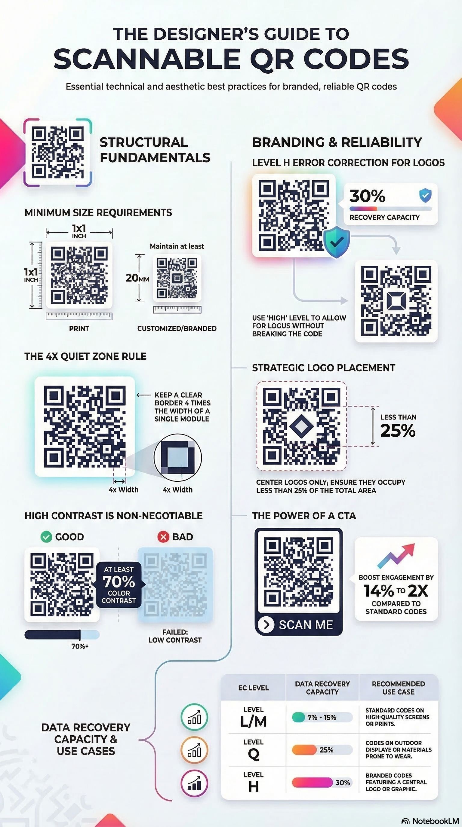
You can easily change the color of the QR code "modules" (the dots) to match your brand's primary color. The Golden Rule: Scanner applications rely on high contrast to distinguish the dark data dots from the light background. Never use low-contrast combinations like yellow on white, or navy blue on black. For the highest success rate, stick to dark patterns on light backgrounds.
2. Changing Shapes (Dots and Corners)
You are not restricted to rigid squares. Modern styling tools can round the corners of the data modules or turn them into perfect circles. You can also customize the "finder patterns" (the three large squares in the corners) to fit an overarching aesthetic—for example, using soft, extra-rounded corners for a friendly consumer tech brand.
3. Embedding Logos
Placing your logo in the direct center of the QR code serves two purposes: brand recognition and trust. Users are far more likely to scan a code if they see a familiar, trusted logo in the center instead of a mysterious geometric maze.
How it works: Embedding a logo actually destroys a portion of the QR code's data. However, the system compensates by using "Error Correction." Before embedding a logo, set your error correction level to 'H' (High - 30%). This duplicates data across the pattern, ensuring the code remains scannable even if the logo covers the center.
5. The Psychology of Color in QR Design
Color is more than just an aesthetic choice; it's a powerful psychological tool that influences user behavior. When you customize your QR code's color, you're not just matching your brand—you're signaling trust and intent.
- Blue for Trust: Financial institutions often use blue QR codes to signal security and reliability.
- Red for Urgency: Retailers might use red patterns for "Flash Sale" codes to drive immediate action.
- Green for Sustainability: Eco-friendly brands use green to reinforce their environmental values.
6. Geometric Branding: Dots vs. Squares
The shape of your data modules carries subtle branding signals. Traditional square modules feel industrial and structured, while rounded dots feel modern and approachable. For high-end fashion or luxury brands, "Classy" or "Classy Rounded" styles offer a refined look that feels more like a pattern than a barcode.
7. Advanced Logo Placement & Scanning Reliability
While the center is the most common spot for a logo, advanced designs can experiment with placement. However, the center is mathematically the safest spot due to how QR scanners read the matrix from the outside in. Always ensure your logo has a "Quiet Zone" (buffer space) so it doesn't bleed into the nearby dots, which can cause scan failures even with High Error Correction.
9. Industry-Specific Design Trends
Design trends for QR codes vary significantly across industries. In the luxury sector, we see a move toward "Minimalist QR" where the code is printed in a subtle, high-quality metallic finish on hangtags. In the fast-moving consumer goods (FMCG) space, "Animated QR" codes (GIFs or videos) are being used on digital displays to draw the eye with motion before revealing the scanable matrix. Understanding these trends allows you to design a code that doesn't just work, but feels "current" within your specific market.
10. Common Design Pitfalls to Avoid
Even with the best tools, it's easy to make mistakes that render a code unscanable. Avoid using complex gradients as the background for the code dots, as the varying contrast levels can confuse sensor logic. Similarly, avoid placing the code too close to the edge of a curved surface (like a bottle), as the distortion can make it impossible for the camera to map the perspective correctly. Always leave a significant "Quiet Zone" and test your design on a variety of devices before finalizing your print run.
11. The Role of Texture in Digital Scanning
When designing for physical materials, consider the texture of the substrate. A QR code printed on a high-gloss, embossed surface will behave very differently than one on recycled, porous paper. The way light hits the embossed edges can create shadows that the scanner might interpret as data dots. Professional designers often use a "double-strike" print method or a clear under-base to ensure the QR modules remain sharp and high-contrast regardless of the underlying material texture.
Unleash Your Creativity
Use our advanced styling tools—from color selection to Photo QR mode—to build a code that represents your brand perfectly and meets the highest professional standards of design and functionality.
Start Generating →